When it comes to choosing color palettes that effortlessly enhance the beauty of wood and stone, I have discovered a range of captivating options. The interplay between these natural elements and the right hues can create a harmonious and visually captivating space. But where do we begin? Well, let me share with you some intriguing color combinations that will elevate your interior design and leave you craving more.
Warm Neutrals With Earthy Tones
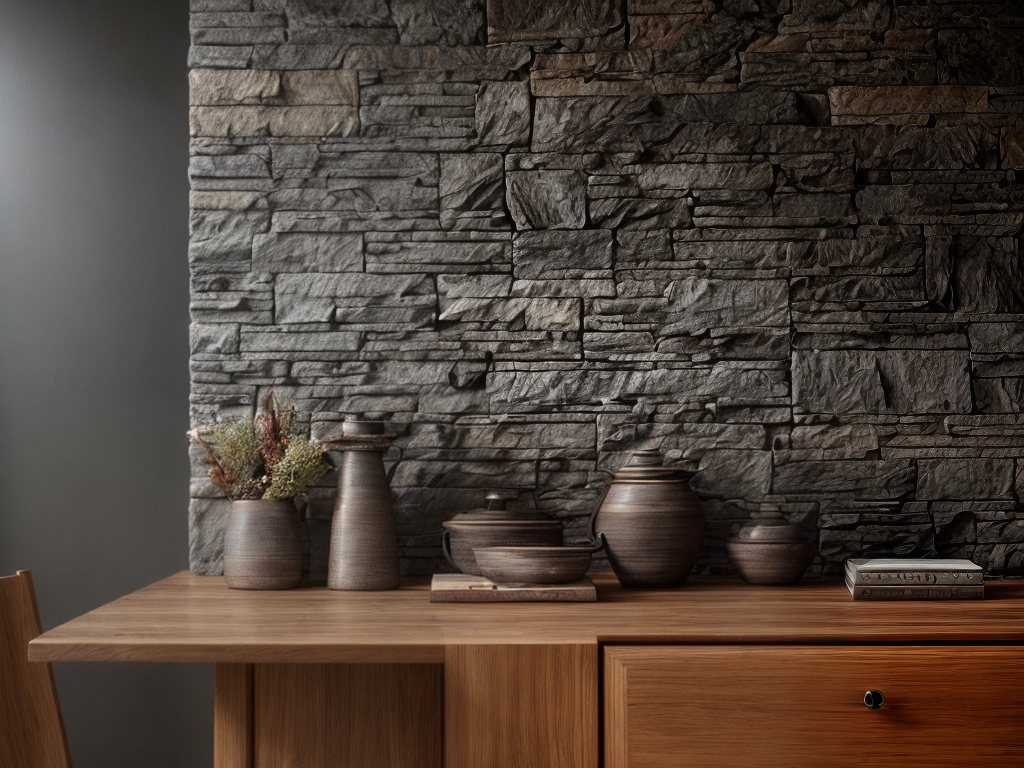
I absolutely love using warm neutrals with earthy tones in my color palettes for wood and stone. There’s something incredibly soothing and grounding about these hues that brings a sense of natural beauty and tranquility to any space. When it comes to choosing colors that complement wood and stone, warm neutrals like beige, tan, and cream create a cozy and inviting atmosphere. These shades provide a perfect backdrop for showcasing the unique textures and patterns of these natural materials.
Earthy tones such as olive green, rust, and terracotta add depth and richness to the color palette. They evoke a connection to the earth and bring a sense of warmth and comfort to the space. These hues can be used in accent pieces like throw pillows, rugs, and artwork to create a harmonious balance with the wood and stone elements.
When working with warm neutrals and earthy tones, it’s important to consider the lighting in the room. Natural light enhances the warmth and vibrancy of these colors, while artificial lighting can sometimes make them appear dull or washed out. Experimenting with different light sources and intensities can help create the desired ambiance.
Incorporating warm neutrals with earthy tones in your color palette for wood and stone allows for a versatile and timeless design. Whether you prefer a rustic, farmhouse aesthetic or a more modern and minimalist approach, these colors work well in any style. Embracing these hues not only enhances the beauty of wood and stone, but also creates a harmonious and inviting space that promotes a sense of liberation and connection to the natural world.
Cool Blues and Grays
When it comes to creating a calming and sophisticated atmosphere, nothing quite compares to the cool blues and grays found in nature. Serene ocean hues can instantly transport you to a peaceful seaside retreat, while sophisticated slate tones add a touch of elegance to any space. Whether you’re looking to create a tranquil bedroom or a sleek and modern living room, cool blues and grays are the perfect choice for achieving a timeless and soothing aesthetic.
Serene Ocean Hues
Cool blues and grays evoke a sense of tranquility and calm, reminiscent of a serene ocean. These serene beach vibes can be effortlessly brought into your home with calming coastal colors. Imagine being greeted by a refreshing palette of soft blues and gentle grays as you step into your living room. The cool tones instantly create a soothing atmosphere, allowing you to relax and unwind after a long day. Whether it’s through a feature wall in a soft gray shade or accent pieces in varying shades of blue, incorporating these ocean hues brings a sense of serenity to any space. The simplicity and elegance of these colors provide a liberating backdrop that allows you to escape the chaos of everyday life and embrace a more tranquil environment.
Sophisticated Slate Tones
With the soothing ambiance of serene ocean hues in mind, we now shift our focus to the sophisticated slate tones of cool blues and grays. These sophisticated slate tones can create a sense of elegance and refinement in any space. They perfectly complement the natural elements of wood and stone, enhancing their beauty and bringing out their unique textures. Cool blues and grays provide a calming and serene atmosphere, making them ideal for creating a tranquil oasis in your home. Whether used as wall colors, accent pieces, or in furniture and accessories, these colors add depth and sophistication to any room. Embrace the liberating feeling of these cool tones and transform your space into a sanctuary of style and tranquility.
Vibrant Greens for a Natural Look
To achieve a natural look, vibrant greens can be incorporated into the color palette for wood and stone. Green hues are a perfect choice for creating a refreshing and serene ambiance in any space. When used alongside wooden elements or stone surfaces, they can enhance the natural beauty of these materials and bring a sense of harmony to the overall design. Here are two ways vibrant greens can evoke an emotional response in your audience:
-
Vibrant yellows for a sunny vibe: By combining vibrant greens with sunny yellows, you can create a color palette that exudes warmth and positivity. Imagine walking into a room with sunlit wood floors and walls painted in a soft green shade, accented by pops of yellow in throw pillows or artwork. This combination instantly uplifts the mood and evokes a sense of joy and happiness.
-
Earthy browns for a natural warmth: Pairing vibrant greens with earthy browns can evoke a connection to nature and create a cozy, inviting atmosphere. Picture a stone fireplace surrounded by wooden beams, complemented by walls painted in a rich green tone. Accents of brown in furniture or decor elements further enhance the natural warmth of the space, making it feel like a retreat in the midst of nature.
Incorporating vibrant greens into your wood and stone color palette allows you to embrace the beauty of nature in your home or office. Whether you choose to go for a sunny vibe with vibrant yellows or create a cozy atmosphere with earthy browns, these color combinations will help you achieve a natural look that is both liberating and aesthetically pleasing.
Bold Reds and Browns for a Rustic Feel
Bold reds and browns can be incorporated into the color palette for wood and stone to create a rustic feel that embraces the warmth and charm of natural elements. When it comes to designing a space with rustic charm, earthy color schemes are essential. The combination of bold reds and browns adds depth and richness to the overall aesthetic, creating a cozy and inviting atmosphere.
To illustrate the impact of bold reds and browns, let’s take a look at the following table:
| Red Shades | Brown Shades |
|---|---|
| Rust | Mahogany |
| Burgundy | Chestnut |
| Crimson | Walnut |
By incorporating these shades into your color palette, you can create a harmonious balance between the warmth of wood and the earthiness of stone. The deep, rich tones of reds and browns add a layer of sophistication and elegance to any space, while still maintaining that rustic charm.
When choosing furniture and accessories, opt for pieces that complement the bold reds and browns. Natural materials like leather, worn wood, and wrought iron can further enhance the rustic feel. Additionally, incorporating textures such as woven fabrics, faux fur, and knitted blankets can add depth and visual interest to the space.
Soft Pastels for a Subtle Contrast
When it comes to creating a subtle contrast in your space, soft pastels are an excellent choice. These delicate color combinations offer a subdued palette that promotes harmony and balance. By incorporating gentle hues into your design, you can achieve a soothing and sophisticated atmosphere.
Delicate Color Combinations
For a subtle contrast in your wood and stone color palettes, consider incorporating soft pastels for a delicate and sophisticated touch. Delicate pastels, with their muted tones and understated charm, can create a serene and calming atmosphere in any space. These gentle hues can beautifully complement the natural textures of wood and stone, providing a harmonious balance.
To evoke a sense of tranquility and liberation, here are two sub-lists of delicate color combinations to consider:
- Soft pink and pale gray: This pairing creates a serene and feminine ambiance, perfect for a bedroom or a cozy reading nook.
- Mint green and light blue: These cool tones evoke a sense of freshness and calmness, making them ideal for a bathroom or a spa-like retreat.
Subdued Tones for Harmony
Soft pastels offer a subtle contrast in wood and stone color palettes, creating a harmonious and serene atmosphere. These subdued shades are perfect for minimalist color schemes, as they provide a gentle touch of color without overwhelming the natural elements in the space. By incorporating soft pastel tones such as pale pink, baby blue, and mint green, you can add a sense of calm and tranquility to the room. These delicate hues work well with the earthy and neutral tones of wood and stone, creating a balanced and cohesive look. The softness of the pastel shades complements the textures and patterns found in wood and stone, resulting in a space that feels inviting and peaceful. So, if you’re looking for a way to enhance your wood and stone color palette while maintaining a minimalist aesthetic, consider incorporating soft pastels for a subtle contrast.
Gentle Hues for Balance
To maintain a minimalist aesthetic while enhancing your wood and stone color palette, incorporating gentle pastels can provide a subtle contrast without overpowering the natural elements in the space. These delicate combinations of soft hues can create a sense of tranquility and harmony in the environment, evoking a feeling of liberation and serenity.
- Soft blush pink and muted gray can create a calming and soothing atmosphere, perfect for a bedroom or living room.
- Pale mint green and light beige can bring a refreshing and airy vibe to a kitchen or bathroom, giving a sense of openness and liberation.
Monochromatic Shades for a Modern Touch
What are the best ways to incorporate monochromatic shades for a modern touch? When it comes to creating a minimalist aesthetic with monochromatic shades, there are several key considerations to keep in mind. First and foremost, monochromatic colors are all about simplicity and harmony. By sticking to variations of a single color, you can achieve a cohesive and unified look that exudes modernity.
One approach to incorporating monochromatic shades is to use different tones and shades of the same color. For example, if you’re working with a warm wood or stone, you could opt for various shades of brown or beige. This creates a subtle contrast without straying too far from the monochromatic theme.
Contrasting colors can also be used to make a bold statement within a monochromatic palette. For instance, if you have a dark wood or stone, you could introduce accents in a lighter shade to create visual interest. This contrast adds depth and dimension to your space, while still maintaining a modern aesthetic.
Another way to incorporate monochromatic shades is by playing with textures and patterns. Mixing different textures within the same color family can create a visually captivating space. For example, pairing a smooth wooden floor with a textured stone wall can add depth and intrigue to your design.
Earthy Yellows and Oranges for a Warm Ambiance
I love the warmth and coziness that warm tones bring to a space. Earthy yellows and oranges create a harmonious ambiance that instantly makes a room feel inviting and comfortable. These hues can be used on walls, furniture, or even in decorative accents to create a warm and welcoming atmosphere in any space.
Warm Tones for Coziness
Earthy yellows and oranges create a warm and cozy ambiance for any space. These warm tones have the power to evoke a sense of comfort and relaxation, making you feel right at home. Here are two reasons why these colors are perfect for creating a cozy atmosphere:
-
Warmth: The rich hues of yellow and orange bring a sense of warmth to a room, instantly making it feel inviting and snug. This can be especially beneficial during the colder months when you want to create a cozy sanctuary.
-
Happiness: Yellow and orange are associated with feelings of joy and happiness. The vibrant tones can uplift your mood and create a positive atmosphere in your space. Whether it’s a splash of yellow on the walls or orange accents in your decor, these colors will infuse your room with a cheerful and cozy vibe.
Embrace the power of earthy yellows and oranges to create a warm and inviting space that brings you happiness and comfort.
Earthy Hues for Harmony
The warm and inviting ambiance created by earthy yellows and oranges sets the stage for a harmonious atmosphere. When it comes to incorporating these earthy tones into your space, consider pairing them with rustic elements like wood and stone for a natural and grounded feel. The key to achieving a harmonious look is through subtle contrast and delicate combinations. For example, you can combine warm oranges with cool grays or soft yellows with rich browns to create a balanced and visually appealing palette. By using earthy hues in your decor, you can bring a sense of warmth and comfort to your surroundings, creating a space that feels welcoming and cozy.
Moody Purples and Grays for a Dramatic Effect
To create a dramatic and captivating ambiance, consider incorporating moody purples and grays into your color palette for wood and stone. These deep, rich hues can enhance the natural elements in your space, adding a touch of mystery and sophistication. Here are some reasons why moody purples and grays can have a powerful impact on your design:
-
Evoke Emotion: Moody purples and grays have a way of stirring up emotions. The deep purples can create a sense of luxury and opulence, while the cool grays can evoke feelings of tranquility and calmness. Together, they create a captivating and introspective atmosphere that draws people in.
-
Create Contrast: Incorporating moody purples and grays into your color palette allows you to play with contrast. The dark shades of purple can provide a striking contrast against lighter wood tones, creating a visually dynamic effect. Similarly, the cool grays can complement the warm hues of natural stone, adding depth and dimension to your space.
Coastal Blues and Whites for a Fresh and Tranquil Vibe
After exploring the dramatic impact of moody purples and grays, it’s time to shift our focus towards the soothing and refreshing ambiance created by coastal blues and whites. Coastal blues and whites are perfect for creating a fresh and tranquil vibe in any space. These colors evoke a sense of calmness and serenity, reminiscent of the ocean and its peaceful waves.
To create a coastal-inspired look, start by incorporating natural textures into your space. Think rattan furniture, jute rugs, and woven baskets. These elements add a touch of rustic charm and complement the coastal color palette beautifully. Coastal themed accessories, such as seashells, driftwood, and coral, can also be used to enhance the overall coastal aesthetic.
When choosing coastal blues and whites for your walls and furnishings, opt for shades that mimic the colors of the sea and sky. Soft baby blues, pale aquas, and crisp whites are all excellent choices. These colors will make your space feel light, airy, and inviting.
To complete the coastal look, consider adding touches of other coastal hues, such as sandy beige or seafoam green. These colors add depth and dimension to your space while still maintaining the overall tranquil vibe.
Rich Jewel Tones to Add Depth and Elegance
As someone who appreciates the beauty and sophistication that rich jewel tones can bring to a space, I believe they are the perfect choice to add depth and elegance to a room with wood and stone elements. These deep, vibrant colors have a way of enhancing the natural elements, creating a sense of luxury and opulence. From emerald greens to sapphire blues, jewel tones can transform a space and elevate its overall aesthetic.
Depth With Jewel Tones
Jewel tones are a rich and elegant option to add depth to your wood and stone color palette. These vibrant hues not only enhance the natural elements in your space but also evoke a sense of opulence and sophistication. Here are two ways jewel tones can create depth and elegance in your design:
-
Contrast and Balance: Pairing jewel tones like emerald green or sapphire blue with warm wood or cool stone creates a striking contrast that adds depth to your space. The richness of these colors complements the organic textures, creating a harmonious balance.
-
Dramatic Accents: Incorporating jewel-toned accents, such as a deep burgundy velvet chair or a bold amethyst artwork, can instantly elevate the visual interest of your wood and stone color palette. These accents create focal points and draw the eye, adding depth and elegance to your overall design.
Elegance in Color
To create an atmosphere of elegance and depth, rich jewel tones can be incorporated into your wood and stone color palette. These deep, vibrant hues bring a sense of opulence and sophistication to any space. Jewel tones such as emerald green, sapphire blue, and amethyst purple can be used to add drama and richness to your interior design. By combining these colors with wood and stone elements, you can create a harmonious balance that elevates the overall aesthetic. The key to achieving elegance in simplicity is to use these jewel tones sparingly and strategically. For instance, you can incorporate them through accent pieces, artwork, or upholstery fabrics. By harmonizing contrasting colors, you can create a visually striking yet refined look that exudes elegance.
Enhancing Natural Elements
Bringing a sense of depth and elegance to your space can be achieved by incorporating rich jewel tones that enhance the natural elements of wood and stone. By using these colors, you can create a warm and inviting atmosphere that celebrates the beauty of nature.
To evoke an emotional response in the audience, consider the following:
- Vibrant Ruby Red: This intense shade brings passion and energy to your space, creating a bold statement that complements the earthy textures of wood and stone.
- Deep Sapphire Blue: This rich and luxurious color adds a sense of tranquility and sophistication to your surroundings, enhancing the natural textures and creating a serene ambiance.
Incorporating natural materials such as wood and stone into your interior design allows you to connect with the essence of the earth. By enhancing these natural textures with rich jewel tones, you can elevate your space to new heights of elegance and create a truly liberating environment.
Pale Grays and Whites for a Clean and Contemporary Look
For a clean and contemporary look, pale grays and whites are the ideal color palette to enhance any wood or stone surface. These soft, muted tones create a sense of calm and tranquility, allowing the natural beauty of the materials to shine through. The clean and minimalist nature of pale grays and whites makes them perfect for those who desire a sleek and uncluttered aesthetic.
Pale grays, such as dove gray or silver gray, provide a subtle backdrop that allows the wood or stone to take center stage. They create a sense of depth and dimension, adding a touch of sophistication to any space. Whites, on the other hand, offer a crisp and fresh look that brightens up the room. They provide a blank canvas for the wood or stone to stand out, creating a bold and dramatic contrast.
When using pale grays and whites, it’s important to consider the undertones. Warm grays with a hint of beige or taupe can add warmth and coziness to a space, while cool grays with blue undertones create a more modern and contemporary feel. Similarly, creamy whites can create a softer and more inviting atmosphere, while bright whites offer a more stark and clean look.
To achieve the perfect balance, it’s essential to experiment with different shades and textures. Matte finishes can create a more subdued and understated look, while glossy finishes add a touch of glamour and sophistication. By playing with the contrast between light and dark, smooth and textured, you can create a space that feels harmonious and visually appealing.
Warm Reds and Golds for a Luxurious Atmosphere
As we continue exploring color palettes for wood and stone, let’s now turn our attention to the captivating realm of warm reds and golds, which effortlessly create a luxurious atmosphere. These rich and vibrant hues have the power to transform any space into a warm and inviting haven. Here are two reasons why warm reds and golds can evoke a powerful emotional response and help you create a luxurious ambiance:
-
Elegance and Opulence: The deep red tones and shimmering gold accents instantly add a touch of elegance and opulence to a room. These colors exude luxury and sophistication, creating a sense of grandeur and richness. Imagine walking into a space bathed in warm reds and golds, where every detail feels carefully curated to create a sumptuous and indulgent experience. It’s an atmosphere that simply oozes luxury and invites you to relax and enjoy the finer things in life.
-
Warmth and Comfort: Warm reds and golds have a natural ability to create a cozy and inviting atmosphere. The richness of these colors adds warmth to a room, making it feel snug and comfortable. Picture yourself curled up on a plush sofa in a room adorned with warm reds and golds, surrounded by soft lighting and luxurious textures. It’s a space where you can unwind and escape from the outside world, immersing yourself in a cocoon of comfort and tranquility.
Soft Pinks and Creams for a Feminine Touch
Soft pinks and creams delicately infuse a feminine touch into any space, adding a gentle and elegant aesthetic. When it comes to feminine color combinations, these soft and romantic shades are a perfect choice. The delicate hues of soft pink create a sense of tranquility and serenity, while the creamy tones add warmth and sophistication.
Incorporating soft pinks and creams into your design scheme can create a beautiful and inviting atmosphere. The softness of these colors can be balanced with natural materials like wood and stone, creating a harmonious blend of femininity and earthiness. Whether you choose to paint the walls in a soft pink hue or incorporate cream-colored furniture, these colors will add a touch of elegance and grace to your space.
Soft pinks and creams are versatile colors that can be used in a variety of spaces. In a bedroom, these colors can create a serene and romantic ambiance, perfect for relaxation and rest. In a living room, they can add a touch of femininity, making the space feel cozy and inviting. In a bathroom, these colors can create a spa-like atmosphere, promoting a sense of calm and tranquility.
To enhance the feminine feel of these colors, consider incorporating soft textures like velvet or silk. Soft pink and cream-colored throw pillows, curtains, or rugs can add a luxurious and inviting touch. Additionally, incorporating metallic accents like gold or rose gold can elevate the elegance of the space.
Dark Greens and Browns for a Cozy and Inviting Space
Now let’s explore the cozy and inviting ambiance that can be created with the use of dark greens and browns. These warm and earthy hues bring a sense of comfort and relaxation to any space, making it the perfect choice for creating a cozy atmosphere. Here are a few reasons why dark greens and browns can transform your space into a warm and inviting haven:
-
Warm Reds and Golds vs Vibrant Greens for a Cozy and Inviting Space:
-
Dark greens and browns have a natural warmth that can instantly make a room feel cozy and inviting. Their earthy tones create a sense of grounding and stability, making you feel at ease in your surroundings.
-
When paired with warm reds and golds, the combination creates a harmonious and inviting space. The rich and deep hues of the greens and browns complement the warmth of the reds and golds, creating a soothing and comforting atmosphere.
-
Soft Pinks and Creams vs Cool Blues and Grays for a Feminine Touch:
-
If you want to add a feminine touch to your space, consider pairing dark greens and browns with soft pinks and creams. The delicate and soft hues of the pinks and creams bring a sense of elegance and femininity to the room.
-
Alternatively, if you prefer a more cool and calming vibe, you can pair dark greens and browns with cool blues and grays. The cool tones of the blues and grays create a serene and peaceful atmosphere, perfect for creating a tranquil space.
Subdued Blues and Grays for a Serene and Zen-like Feel
Subdued blues and grays create a serene and zen-like feel in any space. These serene and calming color combinations are perfect for those seeking a minimalist color scheme for a modern feel. When paired with natural elements like wood and stone, the combination becomes even more powerful, creating a harmonious and tranquil environment.
The softness of subdued blues evokes a sense of calmness and tranquility. It brings to mind clear skies and calm waters, creating a serene atmosphere that promotes relaxation and peace. Whether used as the main color or as an accent, blues can transform a space into a sanctuary of tranquility.
Grays, on the other hand, add a touch of sophistication and elegance to the overall design. They provide a neutral backdrop that allows other elements in the space to shine. From light gray to charcoal, these shades of gray create a sense of balance and harmony, grounding the space and giving it a modern and timeless feel.
Combining subdued blues and grays creates a harmonious color palette that is both soothing and visually appealing. The cool tones of blues and the neutrality of grays work together to create a sense of balance and serenity. This color scheme is perfect for those who desire a minimalist and clutter-free space, as it promotes a sense of liberation and freedom.
Incorporating subdued blues and grays into your interior design can transform any space into a serene and zen-like retreat. Whether you choose to paint the walls in these calming colors or incorporate them through furniture and accessories, the result will be a space that promotes tranquility and a sense of liberation.